Putting good laughs into your good Friday....
Friday, April 14, 2017
Wednesday, September 10, 2014

James Nares, Untitled, 2014, ink on paper, 60 x 95 inches
As in his “Brushstroke” paintings and “Road Paint” series, James
Nares has fashioned his own tools to create a new action series: “Speed
Drawings”. This body of work on paper is created with ink and
brushes and may be described as paintings but Nares views them as drawings as
they are about line. They are also about speed - in the process of their making
and in the result. Not unlike the Damien Hirst “Spin” paintings, Nares has
incorporated a motorized mechanism to create the thrust necessary to make this
work. Large scale paper is affixed to a steel drum powered by a motor making it
spin at high speed. Then he delivers a steady flow of medium with brushes he’s fashioned with an ink reservoir delivering a steady flow of medium like a fountain pen would, allowing for a continuous delivery
of ink without the interruption of refilling his brush.
The method of art making
on a speeding drum has allowed Nares to create a still work that captures speed.
Similar to a photograph documenting speed with a blurred image, these “drawings” comprised of many lines
alluding to the blur of movement from a distance but at close inspection show the detail in the process. The saturation of color in each line delivers a crisp punctuation and the
shifting of color from heavier to lighter creates an effect similar
to light falling on rippled yardage of silk.
The magnitude of this extraordinary new body of work cannot be
understood from images on-line. This is a “must-see” exhibition at Paul Kasmin
Gallery, 293 10th Avenue, NY. The opening is tonight 6-8pm. The fall
season for Chelsea is off to the races with Speed Drawings by James Nares!
Friday, March 14, 2014

My esteemed
colleague, Brian Clamp is co-Juror with artist Mary Ellen Mark for the 5th Annual Contemporary Photography Competition at
Philadelphia Photographic Arts. Christopher Gianunzio, Exhibitions
& Programming Director at PPAC will curate the exhibition.
PPAC is dedicated to
the study, practice and appreciation of photography in the Philadelphia region
offering classes and workshops, exhibitions, lectures, and affordable access to
high-end equipment and services. Entry fees help offset the cost of programs including
“Teen Photo”. This inspiring program is an important artistic and educational contribution
to the city offering its youth opportunities which otherwise would not be
presented. It runs from October to June after school. Students attend field
trips to photography exhibitions around the city, create a book of their own
pictures and have the chance to exhibit and sell their work in PPAC’s gallery.
PPAC provides a digital camera to borrow and free supplies so this program is
not out of reach for those of less financial means.
THE HISTORY OF PPAC:
Director Sarah Stolfa, a practicing photographer, founded the Philadelphia Photo Arts Center (PPAC) in 2009 after graduating from the Yale University School of Art with her MFA in Photography. Sarah created the organization along with founding board members Tom Callan, Martin McNamara, Mary Brown and Stuart Rome.
PPAC was modeled after successful organizations in New York City, Houston, Syracuse and Seattle to provide essential resources for the construction of a vibrant and influential contemporary photography community that would keep artists living and working in Philadelphia.
The existing resources in Philadelphia were analyzed to identify the needs of local community members. One of the primary needs that emerged was affordable access to digital photography equipment in a community setting, since many contemporary artists regularly use digital technology in their practice.
PPAC exists to ensure that contemporary artists
and enthusiasts can continue to learn and grow as the medium of photography
shifts now and in the future.

Friday, January 24, 2014
WHATS NEW IN NEW MEDIA.....Monumental works that fit in a pocket.....
“It's not what you look at that matters, it's what you see.” Thoreau
Life and work have obstructed my blogging for some time but Raphael Rozendaal has sounded the wake up call. Last fall fine art collector, Benjamin Palmer purchased a work of art (a URL) at Phillips de Pury auction. That's correct, he walked out of the auction house with nothing tangible - just a web address on his smart phone and an paperwork documenting the rights and the sale. Palmer doesn't need to invite his friends in for a viewing and he and his artwork are literally "joined at the hip"! He has nothing to hang up with exception of an iPad with internet an connection. This defines virtuality and reality converging in art and commerce. Rozendaal has made 85 works and nearly a third have sold. Raphael envisions his art and accessibility to it as a huge shift in making art available everyone and not only the elite. Collectors are contractually obligated to keep the URL live on the world wide web for everyone's access. They are custodians for the work with an invoice and certificate to prove ownership but the material remains accessible to the mainstream. It sounds like fodder for a Jim Kempner "Madness of Art" episode.
Rozendaal has been brutally criticized in on-line commentary by those claiming this is not art or about as much about art as excrement which is testament to the ignorance of art in today's society. Wake up and smell the 21st century people...this is art whether you respond personally to the aesthetic or not and it has an auction record to prove it. All we seem to need these days to validate art (good or bad as it may be) is validation from the right people acknowledging it as art and the best way to achieve this is with the collector glitterati and auction records being made. So bravo Rozandaal, that's a win for you.
The Artist's writing on the creative process:
"Over the years my work became more abstract. I have no idea why. I have no idea because I have no idea what I’m doing in general. The heart wants what it wants.
An abstract work is a thing, not a picture of a thing. I like both things and pictures of things. Lately I have been making more things than pictures. But it might change in the future. Who knows?
A change of direction is a change of emphasis. There are no absolute directions. There’s always some figuration and there’s always some abstraction.
I follow my interests. I do whatever is most interesting to me at that moment. I don’t have a plan. I’m wandering. I am not in control of my interests. Just think about it… what interests you? Why are you interested in something? Why not something else? I can’t decide where my mind wanders. It would not be wandering if I decided where to go. Wandering is wonderful. You’re just moving around. Not moving to get anywhere, just moving to be in motion.
I like it when I’m somewhere and I’m not thinking too much. Just observing, not making any decisions. Kind of bored and staring at something, looking around, until something presents itself. These moments are the starting points of my work. Whether the work is abstract or figurative, they come from the same “state-of-mind”.
I’m interested in the space between Almost Nothing and Hardly Anything. Something non verbal, sub conscious, non intelligent, not-thinking-too-much. The ideas have no intention other than wanting to exist. Something that exists just because it wants to exist."
NPR interview
USA dealer: Steve Turner Contemorary
Tokyo Dealer: Takuro Someya Contemporary Art
Artist's Site: Raphael Rozendaal
Linticular works on canvas: Postmasters Art, NY
Museum installation: Kawasaki City Museum, Japan
Seoul Square (Korea) - world's largest LED screen VIEW HERE
Tuesday, October 22, 2013

THE NEW YORKER October 21, 3013 - Goings On About Town/Vince Aletti
DAVID MITCHELL - The Dog Must Howl:
New Large Scale Photographs Curated by Lyle Rexer

DAVID MITCHELL, AB 130 Archival Pigment Print
44 x 44 (image: 32 x 32 inches) Edition 5
32 x 32 (image: 24 x 24 inches) Edition 7
The British-born, Bangkok-based photographer makes large, luminous abstractions that look like stained-glass windows designed by a color-field painter. Juxtaposing blocks of hot, cool, and sugar-sweet colors (the spectrum veers from fauve to Necco wafer), he makes images that are at once orderly and trippy. The pictures are Mitchell's attempt to give form to the auras he experiences as a result of left-temporal-lobe epilepsy, and they sometimes appear more atmospheric than solid, as if they were about to evanesce out of their frames. Through Nov. 2

JIM KEMPNER FINE ART
501 West 23rd Street, New York, NY 10011
September 19th - November 2nd
PH: 212.206.6872
Dru Arstark/Sarah Bielicky
Tuesday, November 13, 2012
Sunday, November 4, 2012

Tuesday, August 7, 2012
Edith Newhall Reviews Photography Exhibition at PPAC
 |
Edith Newhall, Art Critic fro The Philadelphia Inquirer reviews Contemporary Photography exhibition at PPAC and features AB 053 by David M. Mitchell in her review making note that his work was one of a few abstract works in the show. CLICK ON IMAGE TO READ FULL ARTICLE.
|
Thursday, June 28, 2012

Kim
Keeveer: Sunset, 2007
pigment
print, 31 x 48" Edition of 6
THE
PERFECT STORM
Opening reception, Thursday, June 28, 6 to 8 pm
Kim Keever is showing with Tom Berenz, Philip-Lorca diCorcia, Julie Heffernan, Bill Jacobson, Simen Johan, Sarah Anne Johnson, Shai Kremer, Lori Nix,
Karin Apollonia Müller and Yuki Shingai
curated by Edna Cardinale
June 28 - August 17, 2012
KIM KEEVER's large-scale photographs are created by meticulously
constructing miniature topographies in a 200-gallon tank, which is then filled
with water. These dioramas of fictitious environments are brought to life with
colored lights and the dispersal of pigment, producing ephemeral atmospheres
that he must quickly capture with his large-format camera.
Keever's painterly panoramas represent a continuation of the landscape tradition, as well as an evolution of the genre. Referencing a broad history of landscape painting, especially that of Romanticism, the Hudson River School and Luminism, they are imbued with a sense of the sublime. However, they also show a subversive side that deliberately acknowledges their contemporary contrivance and conceptual artifice. Keever's staged scenery is characterized by a psychology of timelessness. A combination of the real and the imaginary, they document places that somehow we know, but never were. The symbolic qualities he achieves result from his understanding of the dynamics of landscape, including the manipulation of its effects and the limits of spectacle based on our assumptions of what landscape means to us. Rather than presenting a factual reality, Keever fabricates an illusion to conjure the realms of our imagination.
Keever's painterly panoramas represent a continuation of the landscape tradition, as well as an evolution of the genre. Referencing a broad history of landscape painting, especially that of Romanticism, the Hudson River School and Luminism, they are imbued with a sense of the sublime. However, they also show a subversive side that deliberately acknowledges their contemporary contrivance and conceptual artifice. Keever's staged scenery is characterized by a psychology of timelessness. A combination of the real and the imaginary, they document places that somehow we know, but never were. The symbolic qualities he achieves result from his understanding of the dynamics of landscape, including the manipulation of its effects and the limits of spectacle based on our assumptions of what landscape means to us. Rather than presenting a factual reality, Keever fabricates an illusion to conjure the realms of our imagination.
In further scrutiny of this sunset
image, I believe it was chosen for this exhibition because it captures not only
what we see but what we feel which in this case is pure heat possibly eluding
to an impending doom of global warming.
Friday, June 1, 2012

ellen carey
PHOTOGRAPHY
DEGREE
ZERO
june 2 - july 14, 2012
ZERO
june 2 - july 14, 2012
artist's reception: june 2
5-8pm

Friday, May 11, 2012
New at Jim Kempner Fine Art

Take a spin, the Game of Going Off to
War, 2012. Mixed media. 50 x 50”.
CRAIG NORTON:
TIM
CAME HOME FROM THE WAR AND ISN’T TIMMY ANYMORE
May 12th – June 17th,
2012
JIM KEMPNER FINE ART
501 West 23rd Street
New York, NY 10011
Gallery Director: Dru Arstark (212) 206-6304
Jim
Kempner Fine Art is pleased to present Craig Norton’s second solo show at the
gallery: Tim Came Home from the War and
Isn’t Timmy Anymore, a confrontational
narrative about the horrors of war and the struggles endured by soldiers upon
return from battle. This narrative was created using Norton’s signature technique:
a combination of expressive, photo-realistically drawn faces and hands with
swaths and swirls of wallpaper collage. Three-dimensional wooden structures -
walls, doors, caskets – are incorporated into the tableaux, adding a new sense
of psychological and physical depth. The show will be on display from May 12th-
June 17th, 2012 and the artist will be present at the opening on May
12th, 6 -8 pm.
Craig
Norton’s installations have brought social awareness to issues such as civil
rights and lynching in America (the subject of his first show at Kempner), the
Holocaust and other genocides, and gun violence in America. This most recent
tableaux evolved from conversations Norton had with a family friend, a veteran who
returned after three tours of duty with a purple heart and severe brain
injuries. As a result of these injuries, the veteran felt lost, isolated, and
unable to connect with those around him, symptoms commonly associated with Post
Traumatic Stress Disorder. Using powerfully gestural and evocative collage
techniques, Norton draws attention to PTSD as a pressing national crisis.
A
highlight from the show, Take A Spin, the
Game of Going Off to War, uses dark humor to illustrate the mental and
physical unpredictability every soldier faces.
Similar to a game, viewers are invited to “spin the wheel” to see the
various options: lose an arm, leg or
genitals; come home unhurt, unchanged, the same as when you left; accidentally
kill a non-combatant; die; suffer PTSD; spin again. In My Daddy was a Decorated War Hero, Norton addresses the problems of
suicide among war veterans: a little
girl stands screaming outside a room, where she has just found her father’s
dead body. The dramatic foreshortening
of the man’s body and the twisted expression on the little girl’s face heighten
the dynamism and raw emotion of this image.

My Daddy was a Decorated War Hero detail, 2012. Mixed Media.
48 x 62”.
The artist lives
with his family in Perry, Missouri.
Monday, April 16, 2012
Why is Jonathan Sobel suing William Eggleston?
By Felix Salmon
APRIL 6, 2012
Both Kelly Crow, at the WSJ, and PDN have interviews with Jonathan Sobel, a photography collector who is now suing the legendary color photographer William Eggleston. Neither of them actually posts the suit itself, however; you can find it here.
At first glance this looks like what it is: one of the silliest lawsuits the art world has seen in a very long time. In order to win, Sobel will need to demonstrate two things, neither of which is true. Firstly, he’ll have to show that the value of his vintage Eggleston prints has been diminished as a result of Eggleston making a new series of much larger digital prints. And secondly, he’ll have to show that Eggleston had no right to make the new prints.
In reality, however, Sobel’s prints have probably gone up in value, not down, as a result of Eggleston’s splashy reintroduction to the contemporary art market, in the form of a Christie’s sale which raised $5.9 million and set a new record price for the artist. And in any case, Eggleston has every right to create new editions of his work. Sobel owns vintage 16″x20″ dye-transfer prints; Eggleston can’t make more of those. But creating a brand-new series of 44″x60″ digital prints is perfectly fine.
As Daniel Grant explains, print disclosure laws make explicit exceptions for prints of different sizes, or even just series which have different numbering. And Josh Holdeman, Christie’s international director of 20th century art, goes so far as to say that “I don’t know of any photographers who haven’t produced multiple editions of the same images”: this is undoubtedly standard practice in the art and photography world.
So what’s really going on here? Sobel is no naif, and it’s hard to imagine he thinks he really has much of a case. This suit is brought not for money, but out of a sense of being angry and aggrieved; of having his ownership violated
I haven’t talked to Sobel myself, but my feeling is that the motivation behind the suit comes from a few different feelings about what’s going on with the Eggleston market.
First of all, as PDN’s Conor Risch explained in a great article last month, the Christie’s auction was more or less an explicit attempt to wrest the Eggleston market away from photography collectors like Sobel, and reorient it towards deeper-pocketed contemporary art collectors. Here’s Holdeman again:
According to Joshua Holdeman, international director of the Christie’s photography department, the point of the sale was to establish a new market for Eggleston’s photography in the contemporary art world. “Eggleston has been kind of stuck in the old school world of the photography collectors for a long time, whose primary concerns are about process, print type, print date, etcetera,” says Holdeman.
Whereas the type of print and the exact date a print was made is “a huge deal” for photography collectors, Holdeman says, “for contemporary art collectors it’s much more about the object itself—they couldn’t care if it’s a dye transfer or a pigment print or whatever, as long as the object itself is totally amazing, that’s what they care about.”
“This is an attempt to start a migration of Eggleston from the quote unquote confines of the photography world into the larger context of the art world,” Holdeman adds.
This kind of talk is basically a slap in the face to collectors like Sobel — people who are used to being a big fish in the small photography pond, and who now find themselves small fish in the much bigger art pond. The writing has been on the wall since November 2011, when Eggleston officially joined Gagosian in Los Angeles, but the Christie’s auction was probably enough to tip Sobel over the edge.
It’s often a sad day, for photography collectors, when photographers join high-end art galleries and thereby become much more expensive. I can add a personal datapoint here: I’ve long loved Todd Eberle’s photographs of Donald Judd’s art in Marfa, Texas, and there’s one photograph in particular which I was interested in buying. But when I got in touch with Eberle, he told me to talk to Gagosian, since they’re in charge of selling his prints. And Gagosian, in turn, was perfectly happy to sell me a whopping great 50″x60″ print (plus frame) for $15,000. Even if I could afford that kind of money, I don’t have anywhere to put a photograph that big. But Gagosian isn’t selling the prints in the smaller sizes that photography collectors generally like.
The Gagosian announcement and the Christie’s sale, then, were a sign to Sobel that he wasn’t really wanted in the Eggleston world any more. But what’s going on here is not just a question of whether Eggleston is owned by the photography world or by the contemporary-art world. There’s another issue, too: are Eggleston’s images owned by Eggleston, or did he sell them, in some sense, to the people who bought his photographs?
The legal and moral answer to that question is clear: Eggleston’s images are owned by Eggleston. Sobel owns physical photographs, which have some kind of value. But Sobel, unlike Eggleston, has no right to reproduce those images. But after Sobel shelled out $250,000 for “his” photograph, it’s pretty easy to see how he felt some kind of ownership of what he was looking at, and felt that Eggleston had no right to start creating lots more versions of the same image. (In fact, Eggleston didn’t do that: while Sobel’s prints are generally in editions of 20, the new digital prints are in editions of just 2.) Of course, Sobel’s feelings are neither here nor there when it comes to the merits of his lawsuit, but they probably explain why he brought the suit in the first place.
I suspect that what was most galling to Sobel, however, was the fact that Eggleston had simply managed to conjure up $5.9 million for himself (or rather, for his foundation), without going out and shooting a single new photograph. Eggleston is quite explicitly following in the footsteps of Damien Hirst, here: Hirst was the first artist to shamelessly make millions of dollars by consigning new work directly to auction, much to the displeasure of the art world. And as a result, Hirst has gotten to a point where he, Hirst, captures most of the increase in the value of the global Hirst market — and Hirst’s collectors don’t.
What Sobel sees, when he looks at the Christie’s Eggleston auction, is a serious increase in the value of the Eggleston market, with the overwhelming majority of that increase accruing to Eggleston himself, rather than to collectors who were prescient enough to buy early. You can hear the whine quite explicitly in Crow’s article: Sobel used to own the most valuable Egglestons in the world, and he was very proud of that. And now he doesn’t. And he’s upset.
This is all very childish, of course — which is par for the course when it comes to the art world. And somewhere underneath it all, Sobel might even have a legitimate beef. Eggleston is 72 years old, and suddenly, after decades of being a photographic eminence, he’s deserting the photography community and throwing his lot in with Larry Gagosian and the contemporary-art crowd, just because that’s where the money is. Eggleston has had a devoted following in the photography community for a very long time, and his latest move seems designed to annoy his base, which is never a particularly wise thing to do. There might be lots of money in the contemporary world right now, but that world is fickle.
Here’s the thing, though: if the fine-art crowd ever gets sick of Eggleston, the photography crowd will always be there for him. They’re going to keep the Eggleston faith no matter what he does in his old age. Even if they act out sometimes by filing frivolous lawsuits.
Wednesday, March 28, 2012

DAVID MITCHELL – Photography
JIM KEMPNER FINE ART
501 West 23rd Street New York, NY 10011
(212) 206-6872
501 West 23rd Street New York, NY 10011
(212) 206-6872
Exhibition runs thru May 5
Jim Kempner Fine Art presents the inaugural solo exhibition in the United States for photographer, David Mitchell. Director, Dru Arstark has curated a selection of photographs from several bodies of work completed between 2008 and 2011 representative of the artist’s atmospheric oeuvre and non-objective abstracts.

32 x 32 inches (image size 24 x 24 inches) Edition of 7
44 x 44 inches (images size 36 x 36 inches) Edition of 5
The Linear and Anamnesis works representative of the atmospheric works may be largely influenced by aura occurrences associated with Left Temporal Lobe Epilepsy (LTLE), however the understanding of such is not necessary to appreciate the pure aesthetic beauty of this work. Displacement, anamnesis, place, memory recollection and a wish for sanctuary are all relevant to this work whereas the more recent hard-edged minimal Abstracts 2010/2011 also included in the exhibition are purely based non-objective image making following the rudiments of 20th century Concretism.
With regards to neurological influences and particularly LTLE, Mitchell affirms the perception and perspective becomes distorted and there strangely can be a sensation of a third party presence as if there is something almost “alive” in the scene before during and after seizures.
The Linear series is about sanctuary; it’s safe on the inside from the viewer’s perspective, a room - a window, which belongs to the self, the double mirror, the keyhole, and the see and not be seen. And the view beyond is also a place of safety and gentleness, a transition between the inner places we create and the outside world that we crave for; a simplicity, a softness, a kind introduction to the physical beyond the machinery of consciousness—the simple wish of mind.

Anamnesis No.7, pigment print, 2009
32 x 80 inches (image size 24 x 72) Edition of 3
42 x 116 inches (image size 36 x 108) Edition of 2
32 x 80 inches (image size 24 x 72) Edition of 3
42 x 116 inches (image size 36 x 108) Edition of 2
Additionally (Déjà vu or paramnesia), where a situation seems familiar and in contrast (Jamais-vu or anamnesia), where the familiar becomes alien are relative feelings that can be very strong, very personal, and although disorienting can present a blissful experience more than a frightening one which one might expect of seizures. It is this phenomenon which is the inspiration for the Anamnesis collection (Anamnesis No. 7 exhibiting). “Colors become language-like, as though there is a heightened sense of subtle separation where you can almost read them in tone and graduation. Aside from the altered visual experience, sound may become distorted as well. Local sounds become blanketed as if in a film clip where actual audio has been overlaid or replaced with a soundtrack enhancing the aesthetic experience; distant sounds may become amplified as though nearby.” ads Mitchell.

AB 053
32 x 32 inches (image size 24 x 24 inches) - Edition of 7
44 x 44 inches (image size 36 x 36 inches) - Edition of 5
56 x 56 inches (image size 48 x 48 inches) - Edition of 3
56 x 56 inches (image size 48 x 48 inches) - Edition of 3
In the more recent, non-objective work, where the atmospheric quality of the earlier work is replaced with details and definition, Mitchell imposes current technological advancements in the medium and establishes a new personal archetype. He employs the process of creating assemblages which he photographically chronicles. His process based photographic images followthe rudiments of Concretism, a non-objective art form of the 1940’s that defied all the norms of the Contemporary Art of its time. The central characteristic of this art movement produced works without the influence of any external factors, such as nature, people, or things. By definition, Concrete Art does not require the artist to have a definitive concept or subject. It is about the inventive play of lines, planes, and color, forming unspecific patterns and true expression of the artist’s interest in architecture and the building and layering of materials. It is this movement which gave birth to Constructivism, Suprematism and Neo-Concretism, and Minimalism; all periods in art history which are relevant to Mitchell’s work since his departure from the commercial arena.
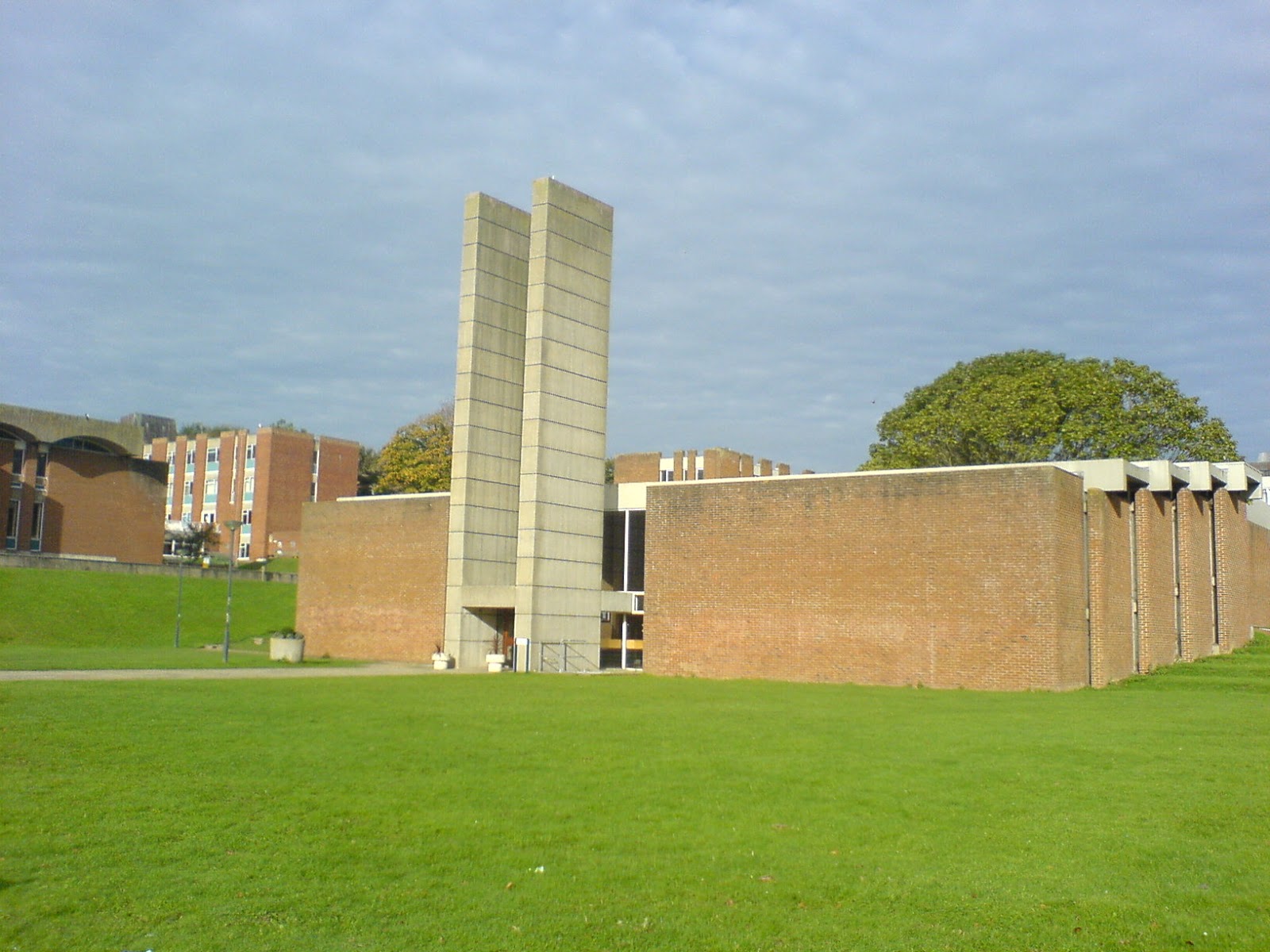
Much of the AB 2011 compositions are based on architecture particularly reconstructed memories of Sussex University in Brighton Hove, UK where Mitchell grew up.
This underlying influence may possibly be related to the left temporal lobe epilepsy in regards to the ongoing obsession with material objects - a phenemenon which can be associated with this condition. Although Mitchell does not seek the re-creation or depiction of specific buildings per se, his manipulation of materials and their assemblage is an architectonic process and the building of such assemblages is a means to the end result whereby photography chronicles the process. It is the photographic print which is the art, not the creation of the material being photographed. As these assemblages are meaningless without photography to finalize the image making, they are decommissioned after the prints are made, leaving no evidence of their existence. The geometrics of the compositions dictate the palette for each image with extreme intuition.
The work is grouped in collections for aesthetic reasons but also, as the auras can be prolonged producing a set of thoughts and sensations that strongly relate to each other—an essay develops naturally. , says Mitchell. Concepts and meanings in words that might invigorate the imagination, or perhaps for the intellect alone are explored which enhance the imagery as in the choice to title the Anamnesis collection thusly. While the experience with auras, is not always evident in the result, it is irrefutably connected in the process of creation as it is in the neurological wiring that presents a compulsive fervor to create.
Artist’s Statement:
The conventional notion that photography is about representation is/has been rejected in favor of pure abstraction. The images themselves along with the process of image making are the subject rather than the depiction of something identifiable. Whether working on the atmospheric images or the more hard-edge aesthetic, my motivation is consistent and I don’t anticipate one oeuvre replacing the other. These dichotomous areas of interest will each continue to develop as will new directions as time progresses.
Thursday, January 12, 2012
Subscribe to:
Posts (Atom)